The Art of ASO: Visual Strategies in Tap Titans 2 and Top Idle RPG Competitors - Part 3 (Video)
With icons and screenshots setting the stage, it’s time to move on to the big show—preview/ promo videos, feature graphics, and App Store poster frames. These visual assets don’t just grab attention; they immerse potential players in the action, excitement, and personality of the game. Let’s take a closer look at how these Idle RPG heavyweights use these tools to captivate audiences and leave a lasting impression.
Video Previews
The Power of Video Previews and Graphics in Idle RPGs
When it comes to catching a player’s eye in the crowded app stores, video previews, feature graphics, and poster frames are your game’s secret weapons. These visual elements don’t just grab attention—they showcase the heart of your game, giving players a front-row seat to the action, humor, and excitement that await them.
Video previews, in particular, pack a serious punch. According to SplitMetrics, apps with video previews can boost engagement and conversion rates by 16%—sometimes even up to 35%—by letting players experience gameplay before they even hit download. For Idle RPGs, this is gold. These games thrive on progression, rewards, and unique characters, and video previews can bring those elements to life in a way screenshots simply can’t.
Meanwhile, feature graphics on Google Play and poster frames on the App Store act as the grand welcome mats of your app page. They’re bold, visually striking, and, when done right, they set the tone for the whole experience. These assets give developers an extra chance to wow potential players and solidify their game’s branding.
In this section, we’ll explore how some of the biggest Idle RPGs—Tap Titans 2, Nonstop Knight 2, Crush Them All, and Almost a Hero—leverage these powerful tools to engage players and stand out from the competition. From thrilling video previews to eye-catching header graphics, let’s see what works, what could be better, and how these games master the art of the visual pitch!
Game by Game Video Analysis
Tap Titans 2: A Great Showcase of Video Previews
Out of all the Idle RPGs we’ve looked at, Tap Titans 2 easily takes the spotlight for its video previews. Not only does it have videos on both Google Play and the Apple App Store (a rare feat!), but it also goes the extra mile with a dedicated iPad video. That’s no small task, considering how much effort it takes to meet Apple’s strict requirements. It’s clear that Game Hive has put in the work to ensure every player gets an engaging experience, no matter where they’re playing.
Tap Titans 2 Promo Video on Google Play Store
Google Play Promo Video: Straight to the Action
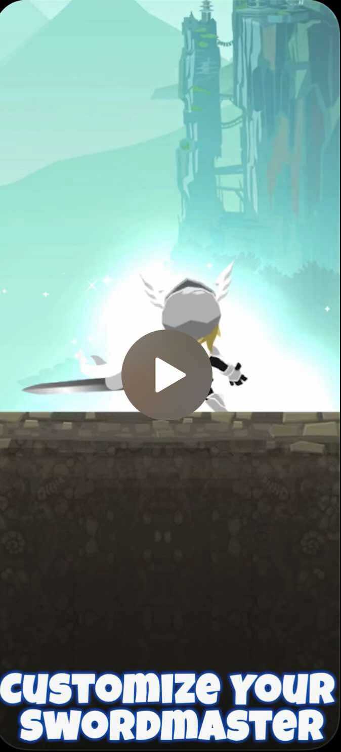
The promo video on Google Play is all about one thing: action. From the very start, you see the main hero relentlessly slashing away at a giant boss with captions like “Tap to Slay Titans!” and “Unleash Ultimate Attacks.” The video does mix things up slightly by showing hero customization, new heroes, and clan raids, but all the scenes follow the same format—battling bosses with the tap mechanic front and center.
While this approach is great for quickly showing what the game is all about, it does feel a bit repetitive and boring. Every scene is just another version of the hero attacking a boss, which might leave viewers wanting more variety. That said, the fast pace and focus on tapping make the core gameplay crystal clear, which is exactly what you want in a promo video.
Apple App Store Preview Video: Richer and More Engaging
Now, the Apple App Store video? That’s where it truly standouts. It’s packed with variety, from boss battles to hero customization, and cool features like “Collect and Discover Powerful Pets” , “Customize a Skill Tree,” where you actually see the progression system in action. The soundtrack also steps it up with an epic, adventurous vibe that adds energy and excitement to the video.
Personally, I find this video much more interesting and engaging than the Google Play version. The variety of scenes and features gives the impression that this game has a lot to do and discover, far beyond just fighting big monsters. It feels more dynamic and fun to watch, making it easier to imagine the adventure you’d experience in the game.
Poster Frame and Feature Graphic: Setting the Tone
- Apple App Store Poster Frame: The poster frame is simple and clean, directly highlighting one of the game’s key features. While effective, it could use a bit more energy to match the game’s action-packed vibe.
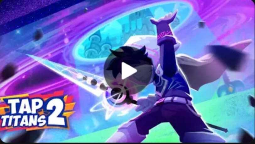
- Google Play Feature Graphic: The feature graphic takes a bolder approach, showing the hero raising a glowing sword with an intense magical aura. The mix of blue and purple in the background makes it pop, while the text “Tap Titans 2” sits subtly in the corner. It’s visually striking and gives off major action-adventure vibes.

Tap Titans 2 feature graphic

Tap Titans 2 poster frame
Nonstop Knight 2: Falling Short on iOS�
Nonstop Knight 2 completely skips a video preview on the Apple App Store—a big miss for attracting iOS users. Video previews are one of the most effective tools for conversion on Apple’s platform, and not having one could mean losing out on a significant chunk of potential downloads. Considering the rising competition in the idle RPG genre, this is a gap that should be addressed.
Google Play Store Promo Video: A Small Video in the Corner?
On Google Play Store, the promo video presents key gameplay elements such as “Fight Monsters,” “Battle Epic Bosses,” and “Customize Warrior.” While these features are well-highlighted, the format is underwhelming. The gameplay itself is crammed into a tiny vertical box on the right-hand side of a large static poster, making it feel disconnected and less engaging. For players, this layout doesn’t fully showcase the action-packed experience Nonstop Knight 2 aims to deliver. If the video took full advantage of the screen real estate with vertical gameplay footage, it would feel far more immersive.
Feature Graphic: Room for More Personality?
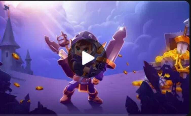
Now let’s talk about the feature graphic. This is one of the first things you see when you land on the game’s Google Play page, so it should immediately grab attention and invite users to learn more. While Nonstop Knight 2’s feature graphic shows the main hero in a strong pose with treasure spilling out of chests, it feels a bit barebones. Don’t get me wrong—the art is clean and polished—but it’s missing something to truly stand out.
Adding some text to highlight the game’s unique personality could make a big difference. A bold tagline like “Epic Dungeon Crawling Awaits!” or “Tap, Fight, and Conquer!” could go a long way in drawing players in. Remember, this graphic should serve two purposes: entice people to hit play on the promo video and convey the game’s core value at a glance. Right now, it leans more on the visuals, but with a little tweak, it could pack a bigger punch.

Nonstop Knight 2 Feature Graphic
Crush Them All: A Solid Effort With Room to Shine
Missing Video on Apple App Store Like Nonstop Knight 2, Crush Them All does not have a video preview on the Apple App Store. This leaves iOS users without a dynamic way to see the game in action, and it misses a way to boost conversion rates, especially in mobile gaming.
Promo Video on Google Play Store: Great Start, But Could Be Better
The Google Play promo video is solid—it ticks off all the right boxes by showcasing gameplay and features like “Assemble Epic Teams,” “Battle Epic Bosses,” “Defeat Real Players Worldwide,” and “Play AFK and Become Stronger.” Each segment is fast-paced and visually engaging, with gameplay footage displayed on phones and tablets. This adds a touch of authenticity, giving potential players a clear idea of what to expect.
But here’s the thing: while the video is good, it doesn’t quite wow me. The frequent use of device overlays is practical but feels a bit distant. Using full-screen, dynamic gameplay footage could pull viewers in more effectively and create a stronger emotional connection. And those captions? They’re clear, but pretty generic. Something more creative and unique could really help the game’s personality shine through and stand out in the crowded idle RPG space.
Feature Graphic: A Classic RPG Look
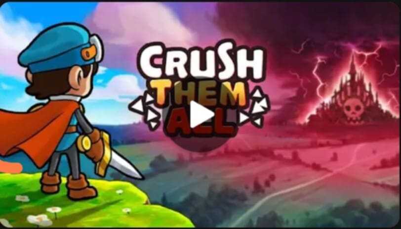
The feature graphic on Google Play is another element worth discussing. It features a lone hero on a green hill gazing at a dark, menacing castle in the distance, with the game logo prominently displayed. This image does an excellent job of storytelling in a single frame—it clearly sets the tone of an epic RPG adventure where the player is the hero embarking on a journey to face a formidable foe. The visual contrast between the bright, hopeful foreground and the ominous, foreboding background is striking and effective at catching attention.
While visually striking, adding a text or tagline could reinforce the game’s value proposition. Adding subtle enhancements to the logo, such as a glow or dynamic effects, would also make it more visually compelling and help draw viewers in.

Almost A Hero: Creative Storytelling
Missing Video on Apple App Store Almost a Hero doesn’t have a promo video on the Apple App Store. Video previews are proven to boost conversion rates, and not having one on Apple means losing out on some potential downloads from iOS users who might prefer visual demonstrations of gameplay over static screenshots.
Promo Video on Google Play Store: A Creative Storytelling Approach
Now, onto the good stuff—the Google Play promo video. What sets it apart is its storytelling approach. Unlike many idle RPG promo videos that simply cycle through scenes of gameplay and feature highlights, Almost a Hero takes a more narrative-driven approach. It begins with a weak hero dealing minimal damage and then dives into an upgrade montage, showing the hero’s transformation. The video continues the story by introducing new teammates, showcasing artifact evolution, and culminating in a triumphant victory with a satisfying shower of gold.
This storytelling makes the video feel like a mini-adventure, keeping viewers entertained and engaged. It’s playful, lighthearted, and effectively communicates the game’s core mechanic of progression while keeping things fun.
While the video does a great job of telling a story, it leans heavily on generic idle RPG features like upgrading, team building, and earning rewards. These are staples of the genre, and while they’re important to show, they don’t differentiate Almost a Hero from other games.
The video will be more perfect if it can highlight what makes this game unique. Does it have quirky character personalities? Are there unusual gameplay mechanics or distinctive visuals? These could have been included to make the game stand out. For example, showing a particularly hilarious or unique in-game moment could have added a memorable hook.
Promo Video in Idle RPGs: A Quick Wrap-Up
After analyzing the videos, feature graphics, and poster frames of Tap Titans 2, Nonstop Knight 2, Crush Them All, and Almost a Hero, here’s what we’ve discovered.
Tap Titans 2: A Multi-Platform Star
The biggest win for Tap Titans 2 is its presence on both Apple App Store and Google Play Store, with videos optimized for each platform. Its Apple preview video stands out for its polished feel, diverse scenes, and dynamic pacing, while its Google Play promo video focuses on gameplay and core features. This strategic multi-platform approach positions Tap Titans 2 as a leader, ensuring it captures attention across audiences. Combined with a strong feature graphic and poster frame, Tap Titans 2 does an excellent job of boosting conversion rates and reaching more players.
Nonstop Knight 2: Good, But Room to Grow
Without a video on Apple App Store, Nonstop Knight 2 misses out on engaging iOS users. Its Google Play promo video covers key features but underwhelms visually, with gameplay confined to a small corner of the screen. The feature graphic is bold and vibrant but lacks any descriptive text to hook potential players or convey the game’s value. While the basics are there, Nonstop Knight 2 doesn’t fully capitalize on its visual assets.
Crush Them All: Bright and Fun, But Needs More
Crush Them All offers an enjoyable Google Play promo video, showcasing gameplay and multiplayer battles with a splashy, energetic tone. While fun to watch, the captions are fairly generic, and the video doesn’t explore unique features to make it truly distinctive. Its feature graphic, while visually appealing, would benefit from adding descriptive text to better convey the game’s personality. It’s solid overall but plays it safe rather than standing out.
Almost a Hero: Creative and Refreshing
Almost a Hero earns points for its creative storytelling approach, making its Google Play promo video fun and memorable. Instead of just showcasing features, it tells a story, which is refreshing compared to other promo videos. However, it’s held back by the absence of a video on the Apple App Store, limiting its potential reach. Additionally, while the storytelling is strong, the video could highlight more unique features to set itself apart from competitors.
Key Takeaways
Tap Titans 2 leads the pack with its multi-platform presence and engaging visuals, ensuring strong conversion rates and reach. Almost a Hero wins in creativity but could broaden its appeal by focusing on more unique features and expanding to Apple. Nonstop Knight 2 and Crush Them All do a decent job but don’t push the envelope, leaving room for improvement in both video design and feature graphic storytelling. A balance of creativity, clarity, and platform consistency is the key to maximizing visual impact and boosting conversion rates.
Now that we’ve explored and analyzed all the ASO visual elements—icons, screenshots, videos, feature graphics, and poster frames—of these awesome idle RPG games, I hope you found this journey as insightful and fun as I did! What are your thoughts on these games’ ASO visual strategies? Do you agree with my analysis, or do you have a different perspective? I’d love to hear your opinions—feel free to share them in the comment section below! Let’s keep the conversation going!

