The Art of ASO: Visual Strategies in Tap Titans 2 and Top Idle RPG Competitors - Part 1 (Icon)
With a simple tap, players dive into the world of idle RPGs—but before they even start tapping, it’s the visuals that decide whether they’ll download. In a genre where first impressions are everything, the right icons, screenshots, and videos can make or break a game’s success. This analysis pulls back the curtain on the visual ASO strategies of Tap Titans 2 and its top competitors, exploring how the best games leverage powerful visuals to capture attention, stand out in search results, and turn casual browsers into loyal players. Let’s see what separates the idle RPG titans from the rest of the crowd.
Icons
Screenshots
Video Previews
Why Idle RPGs?
Idle RPGs have found a sweet spot in mobile gaming, letting players level up, collect heroes, and defeat powerful enemies with just a few taps—or even none at all. It’s a genre built on the joy of progression and power, without the need for constant engagement. But to stand out in the app stores, these games need visuals that scream “epic adventure!” while instantly communicating what makes the game special.
In idle RPGs, visuals do the heavy lifting. A single screenshot or icon needs to capture the thrill of leveling up, recruiting a powerful hero, or defeating the next big boss. That’s why I’m diving into the visual ASO strategies behind some of the biggest titles in the genre, seeing what makes them successful and what could make them even better at grabbing players’ attention.
Meet the Games We’re Analyzing
To get a solid view of visual ASO in the idle RPG world, I picked a mix of industry giants and ambitious competitors:

Tap Titans 2
(Game Hive Corporation)
Our benchmark game and a major hit, Tap Titans 2 has perfected the tap-to-progress mechanic, with loads of heroes, clan battles, and enough upgrades to keep players hooked. Its ASO visuals set a high bar for showing off progression and community play.
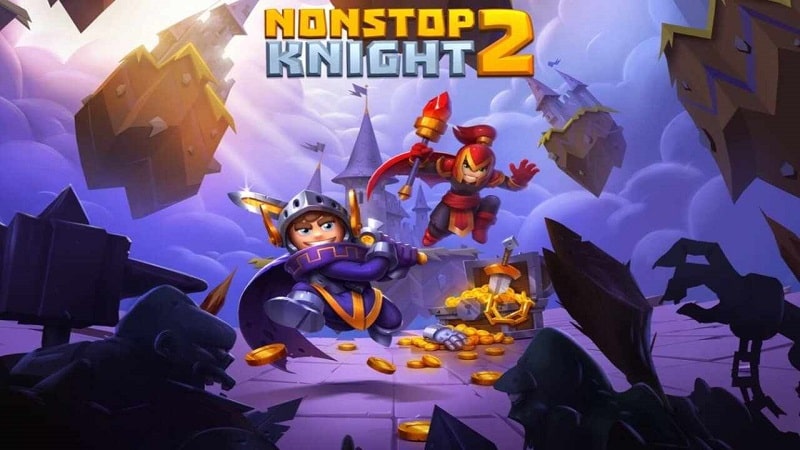
Nonstop Knights 2
(Flaregames)
A fast-paced idle RPG with action and loot galore, Nonstop Knight 2 focuses on customization and upgrades. It’s all about dynamic battles, and its visuals aim to capture that excitement.
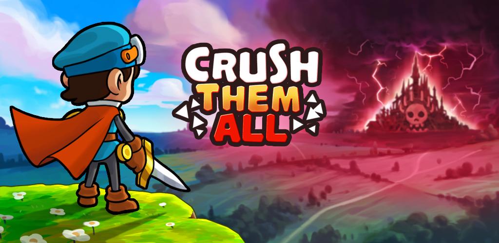
Crush Them All - Idle RPG
(Stillfront)
This game invites players to collect and upgrade heroes as they crush their way through enemies. Its visuals are designed to show off the thrill of assembling a powerful team and leveling up.

Idle Heroes - Idle Games
(DHGames)
As a strategy-heavy idle RPG, Idle Heroes lets players collect heroes and build powerful teams. Its ASO visuals highlight the variety of heroes and the depth of progression, appealing to those looking for more strategy in their idle games.
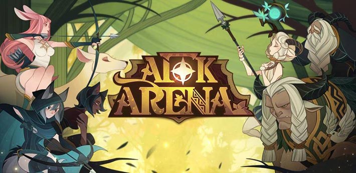
AFK Arena
(Lilith Games)
Known for its unique art style and deep lore, AFK Arena combines hero collection with storytelling. Its visuals are polished and cohesive, showing players the world they’re about to dive into, from epic heroes to big battles.
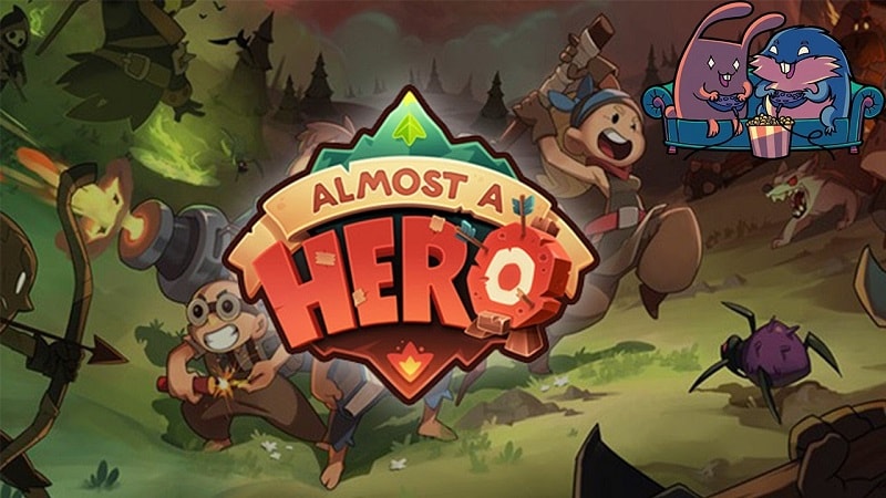
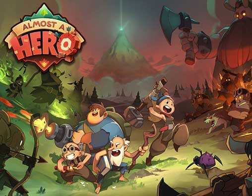
Almost a Hero
(Bee Square Games, Deca Games)
This quirky take on the genre brings humor into the idle RPG space, following a team of unlikely heroes. Its visuals emphasize the game’s humor and progression, attracting both casual players and RPG fans.
First Impression: Icon Analysis & Comparison
Why Icons Matter in Idle RPGs (and all apps)
In idle RPGs, the icon is your game’s first impression—a quick visual handshake that invites players into a world of progression, heroism, and epic battles. To stand out in the app store, the icon must instantly convey the game’s core appeal, whether that’s collecting heroes, engaging in combat, or building power over time. Successful icons in this genre often feature bold characters, powerful weapons, or symbols that capture the game’s spirit at a glance.
Icons play a vital role in both the Google Play Store and the Apple App Store, though each platform presents unique considerations:
- On Google Play: Search results primarily display small icons alongside app titles, which means the icon is the primary visual driver for attracting attention. Here, the icon and the title alone must make an impact and communicate the game’s appeal effectively.
- On iOS: Apple’s search results allow more visual storytelling, displaying the icon along with the first three portrait screenshots (or one landscape screenshot). This arrangement lets the icon work together with the screenshots as a single visual unit, giving us more room to highlight key features and gameplay elements.
Icon Analysis
First, let’s take a look at our games’ icons.
Tap Titans 2
Nonstop Knight 2
Crush Them All
Idle Heroes
AFK Arena
Almost A Hero
Tap Titans 2:
This icon stands out with its bold colors and dynamic scene—a hero facing a giant boss. It instantly communicates action, progression, and high stakes, drawing in players looking for an epic journey. It’s one of the most effective icons here, appealing directly to RPG fans who love a sense of growth and challenge
Nonstop Knight 2:
While the simple sword design against a bright background is clear and easy to recognize, it lacks the excitement and storytelling seen in other icons. This minimalist approach may attract casual players but could miss out on those seeking a more character-driven, immersive RPG experience. Overall, it’s effective in simplicity but doesn’t quite capture the depth idle RPG players often look for.
Crush Them All:
The warrior with a determined expression and bright background is engaging and character-focused. It communicates the game’s lighthearted and casual tone, which appeals to players looking for a fun, character-driven experience. While it may not convey epic battles, it successfully attracts a more casual RPG audience, making it a strong choice for its target players.
Idle Heroes:
Featuring a mythical creature, this icon appeals to fantasy lovers and players drawn to strategic team-building. The creature adds a layer of intrigue, and the icon suggests depth and strategy. However, its darker color scheme may make it less eye-catching at a glance, so while it’s effective for fantasy and strategy fans, it may be slightly less attractive to a broader audience.
AFK Arena:
With its soft colors, serene characters, and the word “Companions,” this icon is unique and visually distinct. It appeals to players interested in a story-rich, character-driven experience, setting it apart from more action-focused icons. For players seeking depth and narrative, this is one of the most effective icons, as it clearly conveys the game’s focus on relationships and storytelling.
Almost a Hero:
This icon is bold, humorous, and inviting, with a knight on a bright background. The exaggerated expression hints at the game’s playful approach, making it appealing to players who enjoy humor and a casual RPG experience. It’s highly effective for its target audience, though it may not attract those seeking an intense, epic journey.
Summary
In this analysis, we’ve looked at how each icon uses color, characters, and style to grab attention and give players a taste of the game’s vibe. Icons that are bold and character-driven, like Tap Titans 2 and AFK Arena, do a great job standing out and clearly show what makes these games special. Tap Titans 2 draws in players ready for an epic, action-filled adventure, while AFK Arena speaks to those looking for a rich, story-driven experience. Crush Them All, Idle Heroes, and Almost a Hero also hit the mark by appealing to their specific audiences with playful, fantasy, or humorous designs. Nonstop Knight 2, with its minimalist sword, is easy to recognize but might benefit from a bit more character to attract players who love immersive RPGs.
Of course, an icon’s true impact isn’t just about how good it looks. To really see what works, it’s important to test icons regularly and tweak them based on how well they’re converting. Even small changes and ongoing optimization can have a big impact, helping your icon stay fresh and relevant to your audience.
Another great strategy? Updating icons for major game updates, holidays, or seasons. A winter-themed icon or a spooky Halloween twist can draw in new players and keep things fun for existing ones. Just make sure to switch back when the season ends—no one wants to see Santa still hanging around in July! (like Crowded City icon in my previous case study)
Localization is also worth considering. Tailoring icons for different countries can make your game feel more relatable to players around the world.
Stay Tuned For Part 2
Now that we’ve explored how each game’s icon grabs attention and sets the tone, it’s time to go deeper. The icon may pull players in, but it’s the screenshots that bring the game to life, showing off gameplay, progression, and those features that make players hit “download.”
In Part 2, we’ll dive into the world of screenshots and see how each game uses them to keep players hooked. We’ll look at what’s working, where there’s room for improvement, and how these visuals make a lasting impact. So, if you’re curious about how screenshots seal the deal, stay tuned for the next part of our ASO journey!

